NIHILGUNZ
| Original review author: | ZenForce in December 2023 |
| Webcomic name: | NIHILGUNZ |
| Author: | Exzeedvelocity aka SLAM_SUCKS aka RF-SLAM |
| Start Date: | Aug 27, 2023 |
| End Date: | Ongoing |
| Genre: | Comedy, Action, Surreal, Noir. Technically also Furry... |
| Defining Flaw: | "It's a total goatfuck!" Richard "Demo Dick" Marcinko, Rogue Warrior, 2009. In other words, EVERYTHING. |
Rating Summary
Background
Newgrounds some months ago did an update for their art section to facilitate the posting of comics, and to celebrate this they throw the Sweet Sixteen Comic, a contest about sixteen pages long comics (it ended yesterday at the time I'm writing this). 128 comics entered in the contest, and while I was browsing the contestants, it stood out in my eyes one of them: NIHILGUNZ: DINER DISASTER (CONTEST ENTRY). The thumbnail it looked good for me, so I decided to enter because it piqued my curiosity, and... Well, it's not good, but it's not worst thing I saw ever.
In the bottom of the post there a blog that basically says that there is more comic, and the sample showed here it was the lasted update of the same. So, I decided to enter the Comic Fury's link left in the blog, because I thought that it will explain what the hell happened here. I had no idea what rabbit hole I was entering. Let's go to the review, before I go blind.
Downfall
Not even the first page, in the comic cover you realize that you entered in a hazardous zone.
Story and Plot
Our protagonist is Malvin P. Ice, aka Malice, a cat guy (I guess?) that was an ex-soldier, nowadays is a mercenary. This guy has serious mental problems and is completely out of touch with reality. He works for a mouse girl called Eliza, a owner of a diner that uses it like a cover-up to dispose of the bodies ... And that is all I can explain logically. Yeah, seriously. The only other explanation I can offer you is the description of the comic:
About how looks and works this world, it's basically the next sentences: 90's dystopian world inside of a hand grenade; everyone has bio-mechanical upgrades; theft in every corner; the police are corrupt pigs sold to the highest bidder; lots of dismemberments, insults and mutations; nobody cares if you die or not (if you are poor); etc.
Art Review
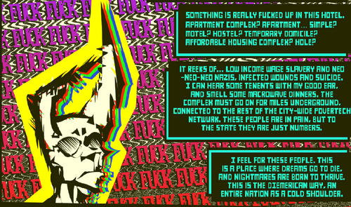
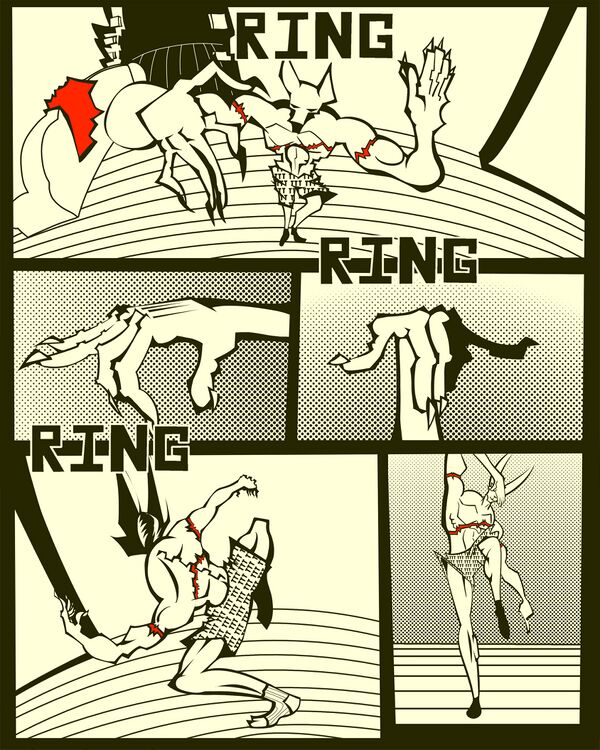
Although not completely, great part of why is so hard to read this is because for the art style. I'm not going to sugarcoat it; the chosen colors are horrible. At the start of the comic is black and white, then we have a combination of blue, red and cyan that looks like the ink of printers, the dialog bubbles of the main character are red in a black background, we have a Technicolor estropodelic TV in the background while Malice is attending the phone, Eliza's dialog bubble are black in a green background, the sky is piss yellow combined with a purple blue (I guess is an artificial sky), it interludes between black and white and color inconsistently... And sincerely my head is starting to hurt. The author clearly wants to emulate 90's, edgy style of skateboard design, but the problem here is that these guys at least knew the color theory to make it look good and relief. Slam's use of color are the most plane and exhausting palette they can use, I would recommend them to at least use less yellow.
The other problem is that the author has no concept of anatomy or perspective. For example, we have page 7 (the provided page), he is supposed to be stretching (or doing karate poses? Not sure); but for me it looks that his members are getting big, small and deforming in very uncomfortable shapes. Like I say before, they were trying to emulate the skateboard art, but in the skateboard art (besides they have anatomy knowledge) when they usually do a close up, they only focus in only one section in specific and only that section, to give the sensation of velocity. But here there's no focus, the author spread the close ups without rhyme or reason, even when there is no one is running or anything. And it happens with everything: low angle perspective, city planes, there is no exception.
Finally, we have that the author doesn't know how to differentiate scenes. The best example is the fact that Malice has hallucinations (or is daydreaming? Is never explained), some of them are really obvious, like the before mentioned Technicolor TV, but other are hard to know if what you are reading is really happening or not. One example is when Malice leaves his apartment and meets with his landlord; we see that he sifts his head off, but in the next page what actually happened is this and is like this constantly. Some say that is good writing, but I say that since everything is deforming all the time, it feels like you are in a dream inside of a dream, and you simply stop to care. Oh, and like an extra, the author reuses drawings. Like a lot, a lot, a lot.
Writing Review
The other 40% of why is so hard to read this is the writing. Let's start with our main character: Malice. The comic treats him like someone crazy; Eliza treats him like someone stupid, I believe that he is both. Basically in the start Eliza calls him for briefcase transportation job, and instead of immediately go to the base (like she orders him), he decides to rob a random salary man, goes to a gas station to buy a shaved ice and a pack of donuts, goes to the library to pay a visit and seduce the librarian called Mancatcher with the donuts, takes a smoke break, decides to use a jet to have a free ride, the pilot attacks him and throws him off the jet, to finally to crawl to the base that is was conveniently close to the crashing zone. He did all this deviation and wandering for what? To lose the job because someone else take it first and later puke his liquefied organs caused by the fall (at first read didn't realize this, I thought that he was randomly puking his organs, you see how well explained it is). At this point I'm asking myself if this guy has shit in his head or what. And his background doesn't make much more sense either. In middle of a battle with the fish man gang's boss, he reveals that he is 600 years old and he saw how his master killed the first mafia boss 250 years ago. Yeah, right, I will believe the guy that has constantly hallucinations.
If you believe that Malice is obnoxious, we have Eliza. Eliza is the whip fanatic, exploitative type of boss. It insults you, it doesn’t matter if you do the job well or badly; considers all his employees like disposable money bringers; it has a non-debatable share of the mission's profit that will change for every error you do in the mission. A woman you want to work for, right? Also she is supposed to be a professional and sadistic ex-assassin according to the fact that a fish guy entered forcefully in the diner place, and he ended like this, but at the same time she is completely unable of dodging literal bullets, even though everyone in this world has mechanical improvements. I mean what? Finally, we have this blue cat guy, which so far in the story doesn't interact with neither Malice nor Eliza (okay, technically he did interact with Eliza, but off-screen, so it doesn't count). The things we know about him are that he is apparently the good guy, he knows Malice somehow, he is the one that take the briefcase mission, he is a professional sword wielder, he likes sunglasses, he somehow found Malice's department and now he is waiting him there. Nothing more about him. The rest of cast has no relevance at all.
Okay, as you look, the characters are not appealing at all, and the great guilty of this is how is everything is written. Exzeed categorized his comic like "Comedy" and... Well instead of explain it, I better show it so you can draw a conclusion: Malice awakes and hits his head with the bathroom's sink, a classic; Malice tries to attend the phone like a normal person, and fails; reference to Persona, ooohh, I get it now; when Malice is gone, Mancatcher gets rid of the gifted donuts throwing it in a bin full of other gifted donuts, ha ha, what a simp; there is a casino that has the shape of a toilet in the background, classy; when Malice is getting in the base, he salute with a smile to a clown (okay, that one made me chuckle); when Big Iron (Eliza's bodyguard) saves Eliza from the missing bullet, she thanks him by asking him angrily where he was, with crossed arms and a caption that prays "fucking stupid youtuber rantsona pose", OMG, what an original and good joke he did here! Why didn’t I come up with this joke? How died Malice? Of Critical Bisexual vomit, why of course! While he is unconscious, he met a metallic insect called Shrimhead, how Malice introduces himself? With a dad joke, what a comedic genius; what, that when Malice awakes of his coma, Eliza gives his weapons parodying The Creation of Adam ¡Joder, esto si es cine! What is this? Everyone is insulting like they have Tourette's Syndrome? Or more like a cartoon represents the Tourette's Syndrome? Wait a minute, a friend sent me a video...
Oh, HOW I BREAK MY RIBCAGE! ¡MEMAZO! As you see, this it's not funny in the slightest... Actually, the comic fails so much in being funny that you start to think is going serious, like this guy in the comment section of the only three that has in the Comic Fury's version (it's so sad):
So what happens if we take seriously? Well, for example, Malice massacred a lot of cops that had the intention of record a live stream of a minority massacre for the views, but he decided to spare one so that he collects the wallets of the dead. What happen? Well, when Malice asks which his wallet is, he says that is the one with a confederate flag! The reason of this scene is here to make you angry; but in the same page it confirms that he known this fact in advance, so WHY THE HELL DID NOT KILLED HIM IF YOU HATE THEM SO MUCH?! And is like this every time, it wants you to get excited with the action scenes, to get upset with the police and the injustice, to be surprised by the gore, but all falls flat with how everything is written (combined with the visuals). So, if it's a comedy, it's not funny, and if a serious story, it simply doesn't make sense. So, what the hell is this then? At this point, this comic has practically the same problems of Ennui Go: both are just random and weird content without substance, both replace character growth by introducing new characters, both can't nail a proper story writing, both is mistaking violence without sense with good comedy. The only differences are that Ennui Go focus more in the sexual jokes and little in the violence, and in Nihilgunz put it all the focus in the violence jokes and next to nothing in the sex (not graphically, at least).
Also, over 200 pages and we still in chapter 1? How many pages left to finish the chapter? Normally the average number is 40-90 pages per chapter (if the comic is divided in chapters in first place), and I'm not refining only to webcomics, but also in graphic novels. This happens to give the story and you a break, but if you don't understand this concept, well; your chapter becomes longer than a chapter in a quantum physics book, no joke. This is exhausting for anyone, I mean, not even in other webcomic's chapters reviewed here are so long.
Author Biography
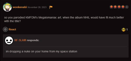
Exzeedvelocity (aka SLAM) is a peculiar person. It looks like they likes a lot to use the letter "z" to make look the words cooler, combined with lot insults that a preschooler would think are bold and cool. I mean just look at the blog section of the comic, literally the only useful post is the one that they is apologizing for not updating because they was sick (although not in that words). And the Newground's News section is not better. This post is my favorite. They usually doesn't respond comments, but when do, well... Let's go back to the contest entry of SweetSixteenComic. A lot of people are pleased with the KMFDM cover parody, except for one person that thought the NIHIL cover would look better, this is the response:
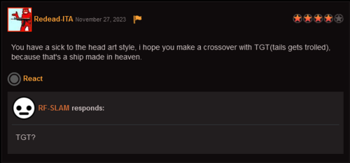
Also there is another post that he hopes that someday he does a crossover with Tails Get Trolled:
It doesn't seem like it, but I can definitely hear their teeth grinding when they was reading the comment. And I understand it... How dare you to compare TGT with this thing! TGT's art style at least is consistent and does not actively seek to burn your retinas. Besides that, Slam is apparently trans, at least is what indicates the simbol next to their name in the Comic Fury's author profile.
Conclusion
Slam comes off as someone who adores 90s edgy humor, but utterly fails replicate it. He thinks that simply having your characters swear or cut themselves makes a comic cool and funny, completely missing the point of making a coherent story or characters that actually make sense - never mind making them likable, if any of them are supposed to come off as 'the good guy' in such a dystopian setting.
Though you know what they say: "If you can't say anything nice, don't say anything", but the only thing what occurs to me is that I kinda like the design of Eliza, althrough it's not enough to save this thing. It simply not worth the read at all. The funny thing that one rules of the contest reads: "If your comic is part of a series you're working on, keep in mind we will not be reading the rest of the series. Though this is a good excuse for starting your series!" And if DINER DISASTER is your introduction to your comic, then I'm not surprised that you won't even make the Top 100.
Links
- The comic's Twitter (Yes, that is their pinned comment)
- The comic in Medibang
- The comic in Globalcomix
- The author's Newgrounds page
- The comic in Newgrounds, it's only a small part, but the author has intentions post the rest of it.
- The author's DeviantArt page, for some reason, they abandoned it after posting page 45.
- The comic in Top Web Comics (I put it here because it has a better description of the comic than the actual description in Comic Fury, you know, the one that written the author)


