My Name is Alice
| Original review author: | fallinq |
| Webcomic name: | My Name is Alice (Hosting site Smackjeeves has been shut down.) |
| Author: | “Noah B. Free” |
| Start Date: | Sept. 20, 2014 |
| End Date: | Died with Smackjeeves, I guess. |
| Genre: | Fantasy/Comedy |
| Defining Flaw: | Backgrounds so lacking in detail that they’re almost nonexistent, inability to depict movement, inconsistent artwork, and SPEECH BALLOONS WITH NO TAILS, SO YOU DON’T KNOW WHO IS SAYING WHAT. Combined, these flaws make it difficult to decipher what is actually happening from panel to panel. |
| Things that aren’t terrible but could use improvement: | Some of the jokes aren’t too bad. |
Rating Summary
Background
Someone posted a link to this on the forum. At first the only reason it caught my eye was because I’m fairly sure that the title is swiped from a Shinedown song that was done for a video game based on a similar concept. I started reading it and realized there was actually quite a lot I had to say about it, so I offered to do a review.
Downfall
Day one, page one. What really kills the strip though, is the lack of improvement. The person who made this has probably never made a webcomic before, so there’s a lot of room to grow, but the last page isn’t any better than the first.
Story and Plot
The plot is a fairly loosely connected string of events based on Alice in Wonderland. There’s a girl (her name isn’t actually Alice, but since the comic hasn’t told her real name I’m just going to call her Alice for simplicity’s sake) who chases a boy with rabbit ears, falls down a hole, and winds up in Wonderland, where wacky things happen.
Now, Lewis Carroll's Alice in Wonderland itself is a rather loosely connected string of bizarre events, but Alice in Wonderland is a classic because of the shear imaginativeness of the characters and setting. Readers of Alice in Wonderland are caught up in this bizarre world and want to see what wacky things will happen next. My Name is Alice doesn’t have nearly that level of imagination. If you’re at all familiar with the original story then you know everything that will happen in the strip before it happens.
Art review
First the good, because there’s so little of it. The author realized their artistic limitations, and opted for a fairly simple, unrealistic style. The art is crude anime knockoff, but is usually depicted in a very basic, cartoony, chibi way. Characters’ hands are often drawn as simple circles, noses aren’t always present, etc. Since the artist has trouble with proportions and anatomy, this was definitely for the best. The simple style keeps everyone from looking hideous or falling into the uncanny valley.
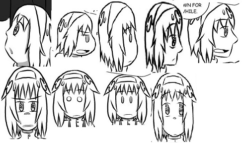
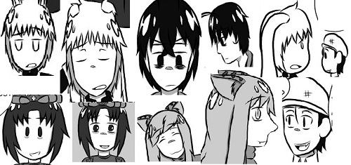
This lack of outright ugliness does not mean that characters are drawn well, however. The author actually manages to both be completely inconsistent about how he draws faces, and still make every character look the same. Characters’ noses change shape depending on what angle they’re viewed at and what emotion the author is trying to convey, but they all have the same features. Hair, clothing, and a few other elements on non-human characters, like ears and tails, are the only real ways to tell characters apart.


And when the author draws emotion on the characters it’s always what Tracy Butler of the infinitely better Lackadaisy called “Generi-spressions.”
Sometimes limbs wind up in impossible positions too, such as Alice’s legs on this page.
Unfortunately there’s a huge drop in quality between the characters and everything else in the comic strip, and when the characters were drawn so amateurishly in the first place, that’s really saying something. Backgrounds range from simple and crudely drawn to almost nonexistent, and the artist CAN’T SEEM TO DRAW WALLS. That’s really baffling, since a wall is basically just a straight, vertical line, but I have yet to see a wall in this comic.
In this strip I assumed that Alice and Whit (rabbit boy) were outside because, you know, no walls in sight. But in the next strip, Whit opens a door that doesn’t seem to be attached to a building (or anything, really), so I guess they’re in a really big room?
Here’s a strip where Alice is supposed to have grown giant size and be pressing against the ceiling. THE CEILING IS HIDDEN OFF PANEL.I guess that while the artist felt comfortable drawing a straight line in the background to represent the ground, Alice pressing against a straight line representing a ceiling was just too crazy. This means the writer has to TELL US that Alice has grown, because her lack of visible surroundings means that we can’t see for ourselves.
The same thing happens when she drinks a shrinking potion and shrinks. Because almost nothing exists in the comic’s environment for comparison, the author had to mark “Original Height” over her head so we can tell she’s shrinking.
Objects in the background are a problem too. Watch and be amazed as the table holding these items disappears completely from one page to the next.
And what the heck is even happening in these three pages? Those aren’t unrelated pages. Those are three pages in this comic, in order from first to last. Double check if you don’t believe me.
This is the main problem with the art. Aside from the characters themselves, the art is BARELY EVEN THERE. It’s so vague, lazy, and inconsistent that it’s often hard to tell what’s supposed to be happening.
The backgrounds very slightly improve in later chapters, only because they exist a bit more, but they’re still very inconsistent. Coupled with the author’s inability to depict motion, pages still end up being confusing messes like this. And make no mistake; the characters still spend a lot of their time in a white void. It just happens about 50% of the time in later comics, instead of 80%.
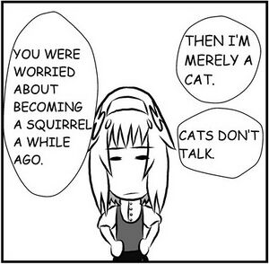
And on top of that, the speech bubbles don’t have any tails pointing from them to the person who’s speaking. They’re just blobs floating aimlessly in the air. So the reader has to figure out who is saying what from the context of what’s being said, and sometimes it’s impossible.

WHY WOULD YOU EVER DO THAT? I mean, how hard is it to add a little tail onto a word balloon pointing at the person who’s speaking? This isn’t just lazy. This is completely mystifying. This person went to the trouble to make this comic, to pump out this many pages over a 16 month period, and completely missed doing this really easy, obvious thing that every comic since the dawn of comics has done. I don’t know. I just don’t know.
The author also clearly doesn’t know how to draw from any perspective except straight on, and makes no attempt to do so. This makes the strip very bland to look at. Overall it’s an astoundingly lazy and unambitious art style.
One final, small note. This comic reads right-to-left, manga style, instead of left to right. Some people, like Andrew Dobson, care about this. I really don’t, although it seems kind of pointless to me. But since this isn’t a physical book, it would have been nice if the author had given some kind of advance warning to the reader about this. As it is, the panels on the first two pages can be read in either direction and still make sense so it took me a few pages to realize what was going on. But that is the very least of the problems with the comic’s art.
Writing review
This comic begins with what may quite literally be the single most pointless use of In Media Res that I’ve ever seen. Alice chases and catches up with Whit, then the comic flashes back to Alice arguing with her sisters, seeing Whit, and chasing after him. Just because you’ve seen more experienced writers use a certain trick doesn’t mean using it in your own story will automatically make your story better. You have to know why that trick is used. Unless the moment you start with is a real winner (something that will completely hook the audience due to how exciting and suspenseful it is), you shouldn’t use In Media Res. And, unless you’re revealing a plot twist or doing some David Lynch shit, you should never do a flashback to something that happened such a short time earlier. This is none of those things.
The first part of the comic is extremely dull. It only gets slightly interesting when Alice gets to the “drink me, eat me” scene because the comic pokes fun at its source material by making some jokes about how absurd it is to eat and drink strange things in a strange place. The “it’s chocolate” gag actually amused me a little.
There’s not much else to say about the writing, really. All the characters from Alice in Wonderland have been turned into teenage anime humanoids, so there’s a lot less variety to them than to their originals in Lewis Carroll’s story.
Author biography
According to this Smackjeeves profile page, the author is a twenty year old named Noah B. Free, who has another comic called Welcome to the REM which I haven’t bothered looking at. However, when I saved some of the comic’s pages to make the two face collages in the art section above, each page proudly announced that it was by someone named Bri. I’m not surprised, because the art and writing of My Name is Alice both SCREAM “teenage girl.” If Bri wants to protect her identity online, she should probably change the names of her image files. Other than that, there’s not a lot of info available on Noah B. Free. She seems like a pleasant and sane enough person, based on the short comments she’s posted on the comic homepage, so no crazy Jerry Springer antics to entertain the masses in this section.
Conclusion
My Name is Alice is clearly the work of an amateur, and everyone has to start somewhere, but that’s no excuse for this level of laziness. The art in this comic has had the same problems for nearly a year and half of its existence because the author specifically avoided drawing anything that challenged her artistic skills. An amateur artist who doesn’t challenge him or herself will never grow, and in time will come to be seen as a bad artist instead of one who’s just inexperienced. If you have trouble drawing something the answer is to study and practice until you get it right, not avoid drawing it when you clearly need to. Backgrounds are important. Characters can’t just wander around in a featureless plain. They need an environment to interact with. AND PUT TAILS ON YOUR WORD BALLOONS DAMMIT, THEY EXIST FOR A REASON.
UPDATE: Smackjeeves has been shut down, and this webcomic was wiped with it.

